

✦
Where Artistry Begins
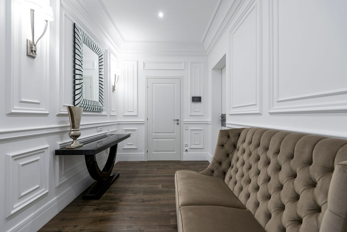
Neutral Venetian plaster colours, the whites, creams, stones and soft greiges, are the shades many people reach for first, because they bring depth and quiet movement to a wall without dominating the room. Zavoré tints and installs Venetian plaster with our own artisans in homes across London, Birmingham, Manchester and the UK, and we always test a neutral on your actual wall, because these subtle shades shift more with light than bolder ones.
Our guide to Venetian plaster explains the finishes these colours sit within, and you can see where we work through Venetian plastering across the UK. Below we compare the main neutral families and how to choose between them.
Venetian plaster gets its character from tiny variations between thin coats. In a neutral colour those variations read as soft clouding, like the surface of honed stone. Strong colours can be beautiful, but neutrals let the texture lead. They also sit easily with timber floors, linen, brass and stone, and they give you freedom to change furniture and art without repainting.
White is never just white. A pure, cool white can look crisp in a modern flat with large windows, but it may turn grey and flat in a dim room. Warm whites with a touch of yellow or red stay soft in low light. Chalky whites, slightly broken with grey, feel relaxed and suit period houses. When choosing, compare whites against something truly white, like a sheet of printer paper, to see the undertone clearly.
Creams bring warmth and are ideal for rooms that get little direct sun. In a Victorian terrace or a north facing bedroom, an ivory Venetian plaster can make the space feel lit from within. The risk is going too yellow, which can look dated next to cool greys. Pairing cream walls with warm whites on ceilings and woodwork keeps the scheme fresh. Creams also flatter lime finishes such as marmorino, where the stone grain adds to their softness.
Stone colours sit between cream and grey and are the most versatile neutrals we offer. They suit hallways, living rooms and open plan spaces because they hide everyday marks better than pale whites. Taupe brings a slightly pink or brown warmth, while greige blends grey with beige for a modern but not cold feel. Pale stones look lovely with travertino in a hallway, and darker stones work well on a feature wall behind a sofa or a bed.
Daylight from the north is cool and steady, so it pulls neutrals towards grey. Southern light is warm and strong, which can make creams look yellow at midday. East and west rooms change through the day. Artificial lighting matters too; warm bulbs flatter creams and stones, while cool bulbs suit crisp whites. That is why we recommend testing a sample board in the room at different times before we make a finished sample on site.
Colour choice rarely changes the price much. The cost is driven by wall area, preparation, ceiling height, access and the finish chosen. A high polish takes more passes than a soft matt surface. We confirm the price after the survey and once you have approved a sample in your chosen neutral.
See our Venetian plaster installation page for the full sequence.
Zavoré was established in 2021 and installs Venetian plaster and every decorative finish across London, Surrey, Birmingham, Manchester and the UK with our own artisans. Our London showroom and training centre can be visited by appointment, which is helpful when you want to compare neutral samples side by side.
No. Even a plain white shows subtle clouding and depth because it is built from several thin, burnished layers. The effect is closer to polished stone than to emulsion, and it changes gently as light moves across the wall during the day.
We can match any NCS reference. If you have a paint colour you love, find its nearest NCS code and we can work from that. Plaster always reads a little differently from paint, so the sample stage is important for checking the final tone.
Very pale whites can show scuffs in busy areas such as hallways. Stones and greiges hide everyday marks better. A wax topcoat helps any colour, and small marks on a lime finish can often be blended back in by hand.
Yes. Polished plaster is the high sheen end of Venetian plaster, so all our neutral colours can be finished matt, satin or polished. The higher the polish, the brighter and slightly cooler the same shade can appear.
To discuss neutral Venetian plaster colours for your home, send photos and rough measurements to sales@zavore.co.uk, or call +44 7592 929191, Monday to Saturday, 9am to 6pm. We are happy to suggest a shortlist of shades for your room.
An outline of what limewash training covers about mixing limewash and the risks of slaking lime, and how to ask Zavoré about it.
BasementsA guide to decorative finishes for London basements, covering media rooms, gyms and wine rooms, why waterproofing must come first, and wh...
CheshireAn in depth guide to seamless microcement and tadelakt bathrooms for homes across Cheshire, and how to choose between them.
CheshireA guide to polished plaster and other decorative finishes for the large modern homes of Wilmslow and Alderley Edge, and where they fit in...
CheshireChester and the Cheshire countryside are full of timber framed, Georgian and Victorian buildings. This guide explains why lime finishes s...
Greater ManchesterHow microcement floors work in kitchen extensions across Greater Manchester, from the screed underneath to underfloor heating and everyda...

Providing luxury finishes for the most prestigious addresses in the world
Venetian plaster, limewash, microcement, tadelakt, metallics, sculptural plaster and gold leaf, supplied and installed by our own team, with Venetian plaster taught at our Birmingham studio.
One list, run by the people who make the material. No noise, and nothing we would not want to read ourselves.
We email as the house has something worth saying, never daily. Unsubscribe from any email, or reply STOP to any text. We never pass your details to anyone.