

✦
Where Artistry Begins
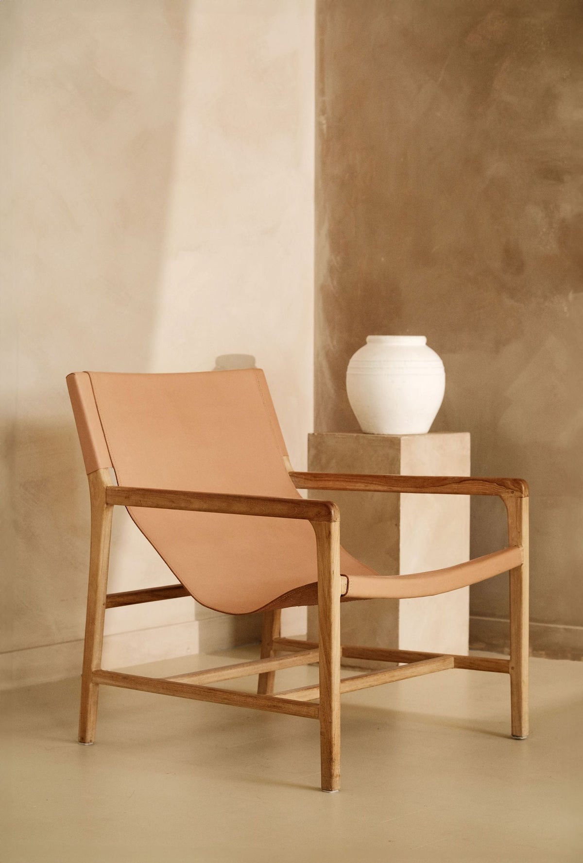
Choose limewash colours by testing them on a board, in the actual room, over several days, because limewash dries considerably lighter than it looks wet, and it keeps shifting for weeks afterwards as the lime carbonates. A colour that looks right on a screen or a paper card will rarely be the colour you end up living with. That is not a flaw in the material. It is what gives a limewashed wall its depth, and it is the one thing everybody underestimates.
Below is how lime behaves with colour, what changes on a large wall, how light direction alters the result, and how to test properly. If you want the material itself explained first, that is the limewash page.
Wet limewash is dark, saturated and flat. As the water leaves, the pigment is left in a thin chalky mineral film and the colour lifts, noticeably, not subtly. Then a second change happens more slowly. The lime draws carbon dioxide from the air and turns back into chalk, which puts a fine white bloom across the surface. That is carbonation, and it lightens and softens the colour again over the following weeks.
So a wall judged on the day it is brushed is being judged twice too early. Give a test board days, not hours, and look at it again a fortnight later before you commit to a whole house.
Limewash is strongly alkaline, so it can only take pigments that survive that. Traditionally that has meant earth colours, ochres, umbers, siennas, greys, chalky whites, soft greens and blues. Modern tinting widens the range considerably, but the deepest, most electric shades a plastic paint can hold are not really lime territory. Our colours page shows what we can tint to, and everything is matched and checked before it leaves us.
A pale limewash on a sample board looks like a colour. The same pale limewash across a whole room often reads as “white with something going on”. The pigment is spread thin, the bloom is proportionally stronger, and the eye reads the brush movement more than the hue.
That is usually the right outcome in a bedroom or a long hallway, where you want atmosphere rather than a statement. It is the wrong outcome if you picked a soft green expecting a green room. If you want the colour to be unmistakable at scale, go a step deeper than the board suggests, or accept three coats rather than two to build density.
The more pigment in the tub, the more obvious the cloudiness. Limewash lays down unevenly by nature. The film is thinner where the brush lifted and denser where it loaded, and pigment makes that variation visible. In a deep charcoal, ochre or blue, you will see the cross hatch movement clearly across the wall.
People either love that or are shocked by it, and the ones who are shocked usually chose a dark colour from a small card. Deep tones also show a stronger difference between the freshly brushed wall and the carbonated one. If you are set on something dark, our notes on working with black and near black finishes cover the same territory in a related material.
Light direction changes a limewash more than it changes a flat emulsion, because the finish has texture and the bloom catches the light.
Artificial light matters too. Warm LEDs push a limewash yellow at night, which can be exactly what you want in a snug and exactly what you do not want in a bathroom.
Testing limewash is not the same as dabbing tester pots on the plaster. A brushed out sample on a real board tells you about the colour, the movement and the finish all at once.
If you are choosing for a whole house, a box of six boards is a cheaper mistake than a room. And whatever you settle on, order the full quantity in one go. We tint to your colour in the tub, but the sensible habit with any tinted lime is to buy the job in a single batch.
Choosing from a screen. Choosing from a printed card. Judging wet. Judging on day one. Picking a pale shade and expecting it to read as a colour at scale. Picking a deep shade and expecting it to read as flat. Matching a limewash to an emulsion swatch. The two materials cannot produce the same surface, so a perfect match on paper will still look different on the wall. Our general guidance in choosing colour for Venetian plaster is worth reading alongside this.
Lighter, and by a clear margin. Wet limewash is dark and saturated; as the water leaves, the pigment sits in a thin chalky film and the colour lifts. It then lightens a little further over the following weeks as the lime carbonates and develops its bloom. Always judge a dried, settled sample rather than a wet wall.
Warm ones. North light is cool and steady, so greys drift blue and whites drift grey. Warm off whites, ochres, soft clay tones and pink leaning greys hold their character in that light. If you want a cool colour in a north room, choose one with warmth underneath it rather than a straight grey.
We can tint close to most reference colours, within the range of pigments that survive lime’s alkalinity. What we cannot do is make a mineral finish look like a flat plastic film. Expect a good match in hue and a different surface, chalkier, softer, with movement. Always confirm on a board before ordering.
Three is usually enough for one room: your favourite, one lighter and one warmer or cooler. For a whole house, order more and live with them for a fortnight. Boards are cheap against the cost of relimewashing a room, and seeing shades side by side settles most arguments quickly.
Where to go next: browse the range on the colours page, order boards and tubs from the shop, and read the limewash page if you are still deciding whether the finish is right for the room.
How microcement floors work in kitchen extensions across Greater Manchester, from the screed underneath to underfloor heating and everyda...
Buying GuideA product by product guide to the protective finishes in the Zavoré shop and which plaster each one is made for.
CommercialWhat London restaurant, bar and hotel operators should know about decorative plaster. Which finishes stand up to busy service, out of hou...
BirminghamFor people thinking about leaving another job for decorative plastering. What a beginner course at the Zavoré Academy covers, the gap bet...
TadelaktAn in depth guide to tadelakt, the polished Moroccan lime plaster, for bathrooms and wet rooms in Welsh homes, cottages and holiday lets.
DubaiHow polished plaster works on staircases and lift lobbies in Dubai villas, from tall stair walls and handrail fixings to protecting busy ...

Providing luxury finishes for the most prestigious addresses in the world
Venetian plaster, limewash, microcement, tadelakt, metallics, sculptural plaster and gold leaf, supplied and installed by our own team, with Venetian plaster taught at our Birmingham studio.
One list, run by the people who make the material. No noise, and nothing we would not want to read ourselves.
We email as the house has something worth saying, never daily. Unsubscribe from any email, or reply STOP to any text. We never pass your details to anyone.